Make a difference.
I designed a visual identity for a new non-profit focused on providing aid and resources to children affected by domestic violence. The logo features a symbolic degree mark (°) to represent transformation and a child on a swing to represent freedom. Clean typography and an uplifting color palette convey trust, liberation, and inspiration. The result is a versatile and impactful brand mark suitable for both digital and print use.

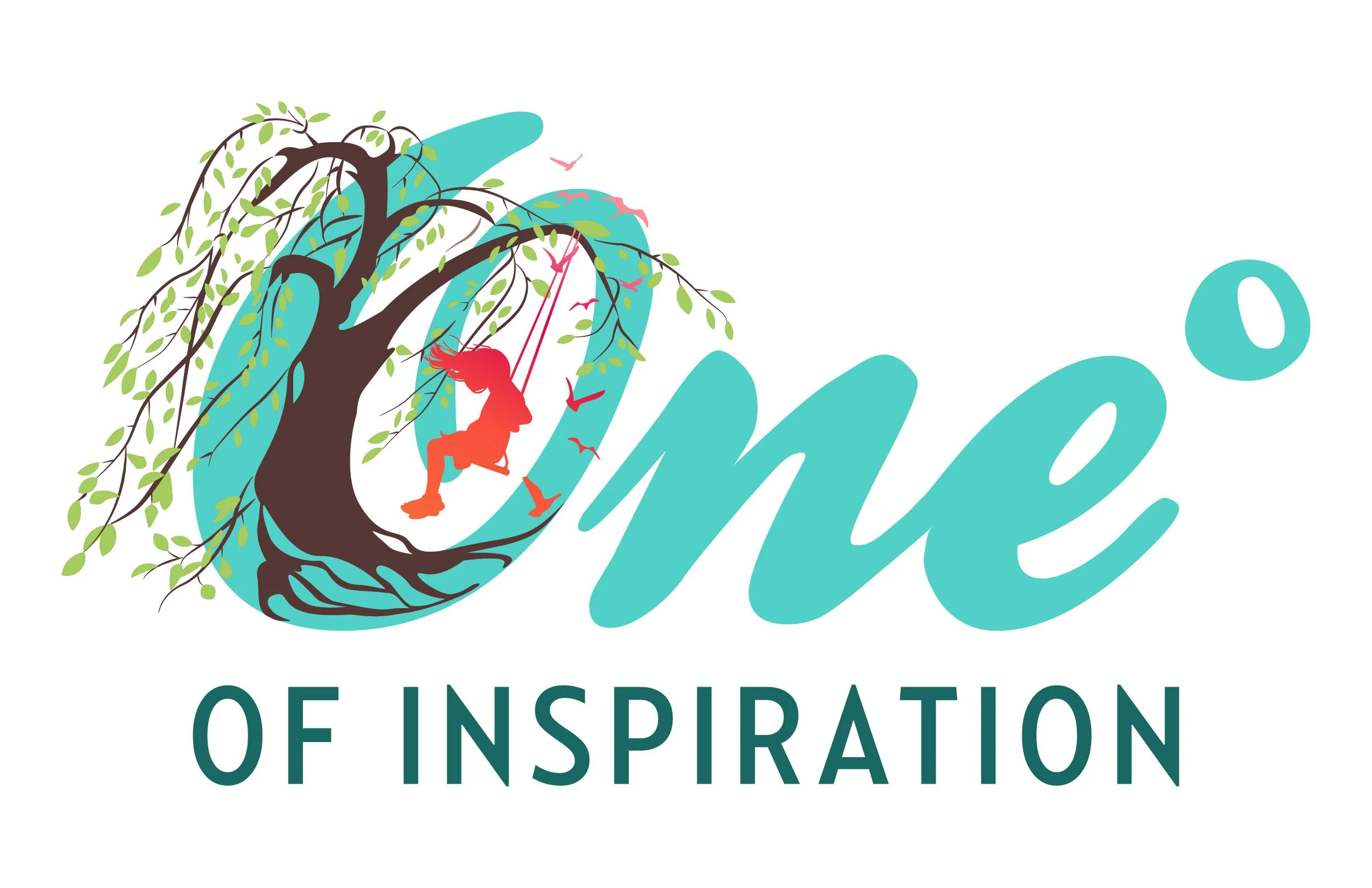
The client had a clear vision for the logo that was quickly achieved. The design needed to center around a flowing, organic tone that reflects growth. At its heart is a stylized tree, with fluid, sweeping lines that evoke movement and energy. Vivid colors were chosen to convey optimism and vibrancy, with bright greens representing renewal. The overall composition feels dynamic yet grounded.
The Process
